BPA Working Progress Promotional Poster
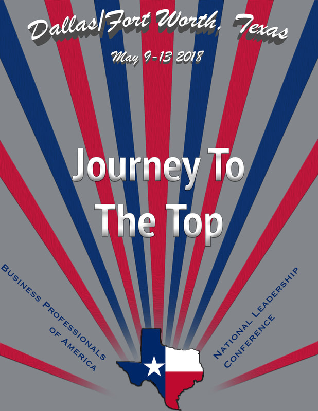
This is where I started with my poster. As you can see it is a petty simple project so far and not a lot of detail to it. This was a starting point to where I wanted to be and as you will see in my final poster I made a huge change. Adding more detail, more elements, and overall cleaner.
BPA Promotional Poster
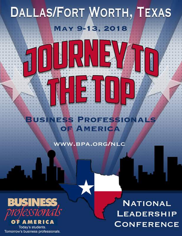
This is my independent project that I put most of my time into the last semester. This is my promotional graphic design poster for BPA. I used Adobe Photoshop and used many tools in the program to create this poster. Such as the rectangle tool, polygon tool, gradient, and many filters. I used the iPAD to draw the Texas and used dropbox to export it. I used a halftone for my background and a half starburst affect. The most fun thing about this project was creating the skyline, it was challenging but fun. The starburst affect which are the lines keep your eyes moving through the poster and I also like that about this project. I am super proud of this creation and is by far my best creation thus far.
BPA Logo
This is my simplified version of my promotional poster. This is called my logo and used specific details that were in my original poster to get my main point across. I used the same tools to create this as in the original project.
BPA Pin

This is yet a more simple version of the poster and the logo. Again using the star and 'Journey to The Top' because that is my main theme and the focal point of my project. All three the poster, logo, and pin were apart of my competition in BPA.
BPA Poster Senior Year
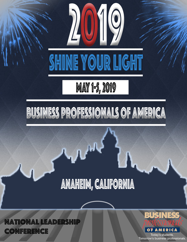
I am very proud of this poster, it isn't as good as the poster above. But I came a long way with this project and it turned out pretty good. The fireworks in the corners are just brushes that I downloaded and I applied a gradient to the corners as well to make them more settle with the poster. The background is my favorite part of this graphic as I created the diamonds in Illustrator then switched over to photoshop. I applied the filter noise to it then inverted the colors so the spaces between the diamonds would be white. Finally, applying gradients to the background from gray to dark blue as the night sky. The background adds a lot of depth to my graphic. The castle I drew using photoshop and then I applied a outer glow to the castle to make it stand out . Then the bottom part below the castle is probably the weaker part of my graphic, but I needed a space filler and its not a bad design for it. The text is one of my favorite parts about the graphic as well because its fun and stands out. Overall I really like this graphic and proud of it.
BPA Logo
The logo is just a more simplified version of the poster itself. I used a lot of the same elements, but just changed some colors of my text. I really like the logo, its simple and I left the text that is important on the logo.
BPA Pin
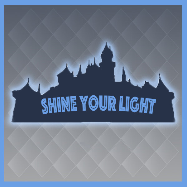
The Pin is an even simpler version of the poster and logo. I used my main element the castle and my theme 'Shine Your Light' because that is my main focal point. I also applied a border to the pin to make the inside pop out a little more.
